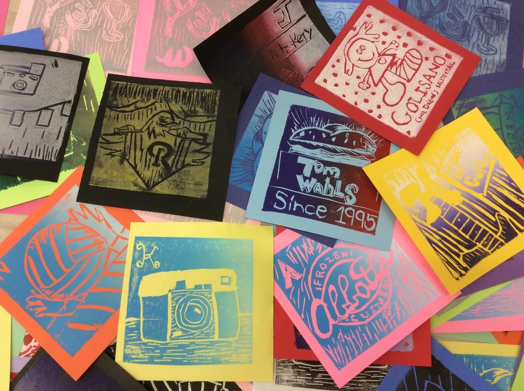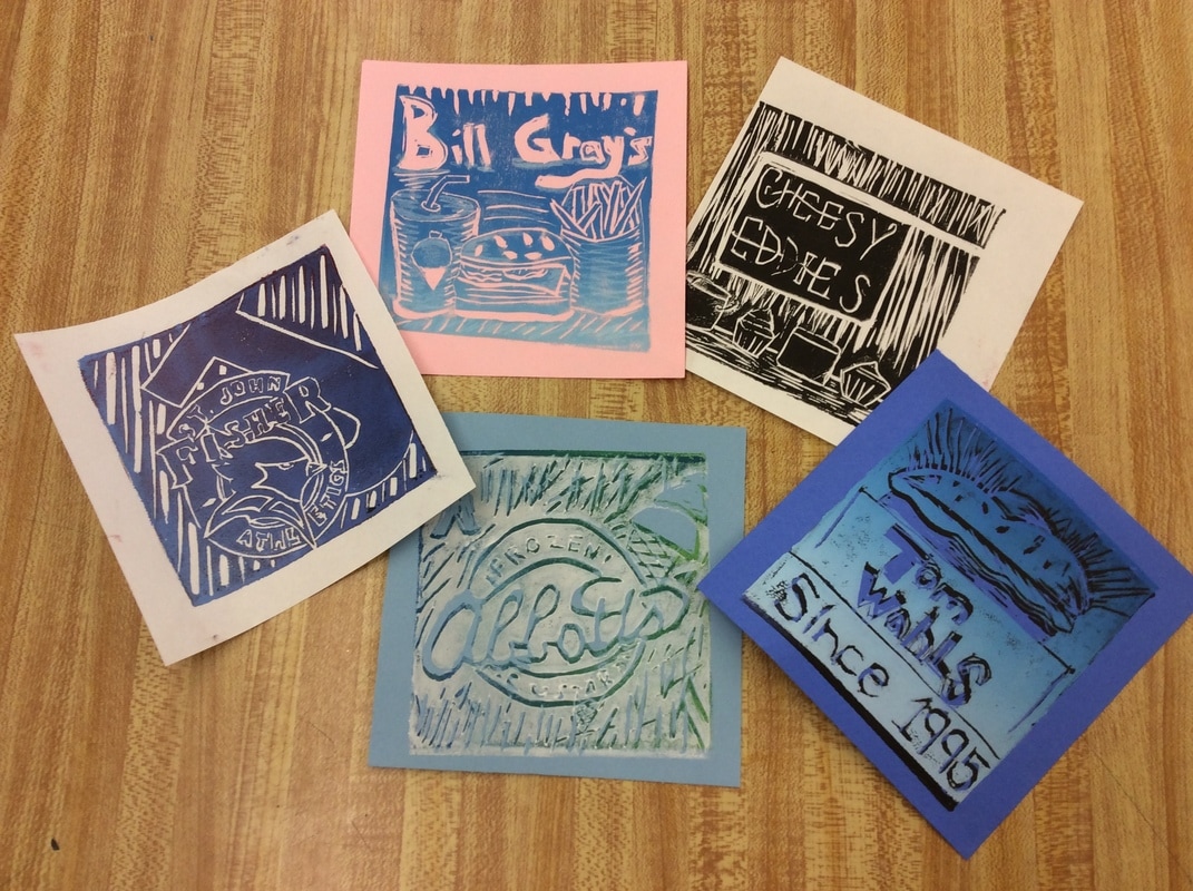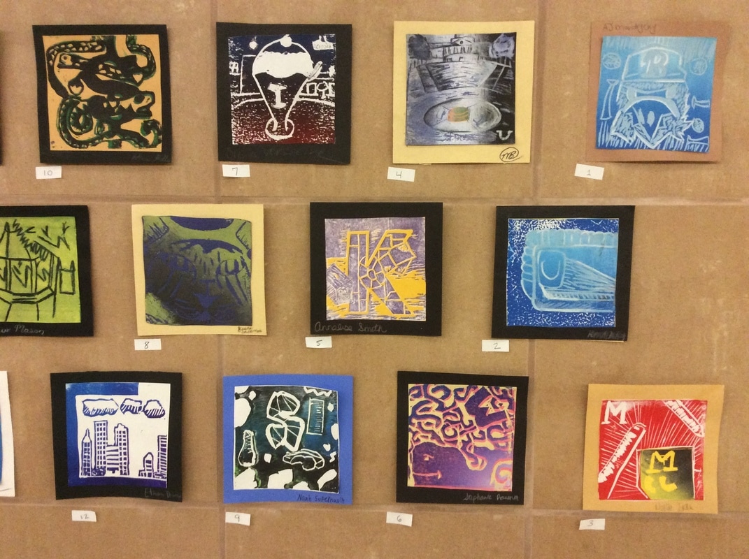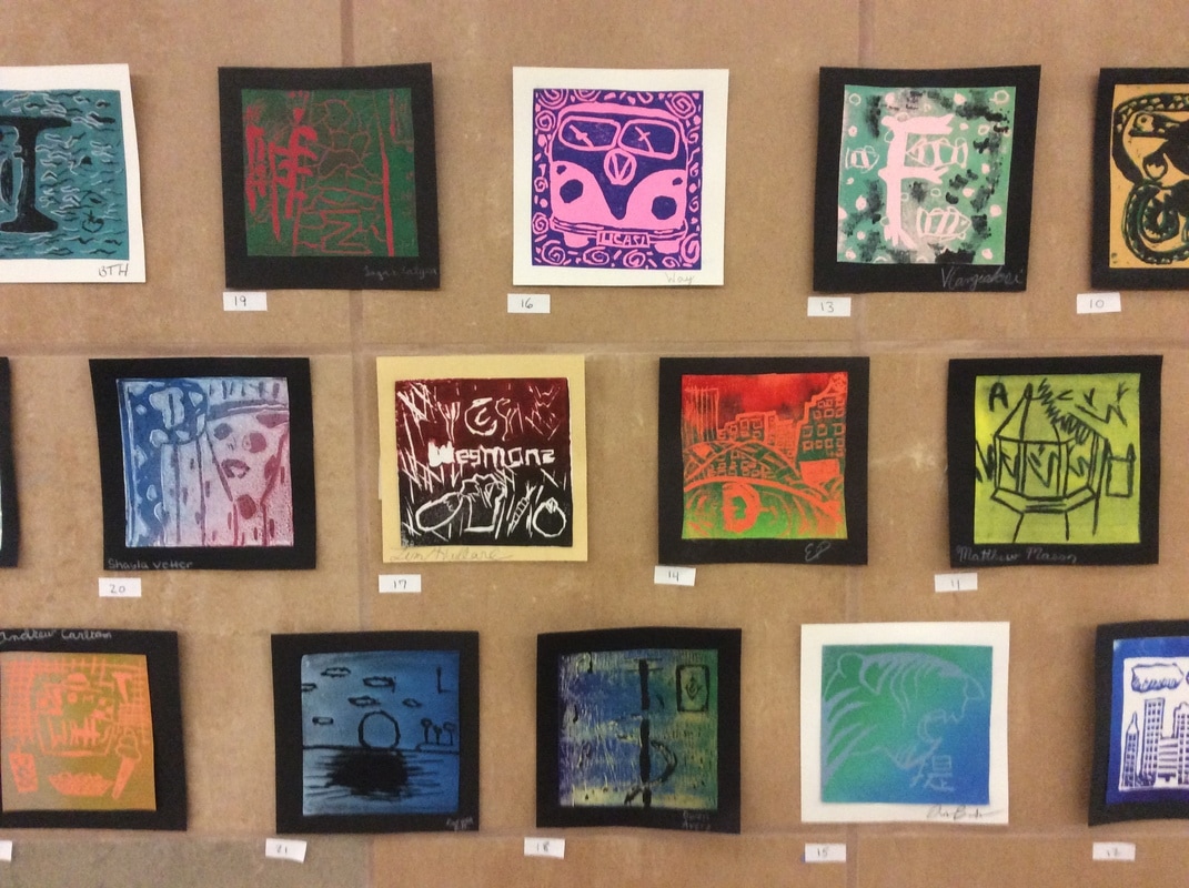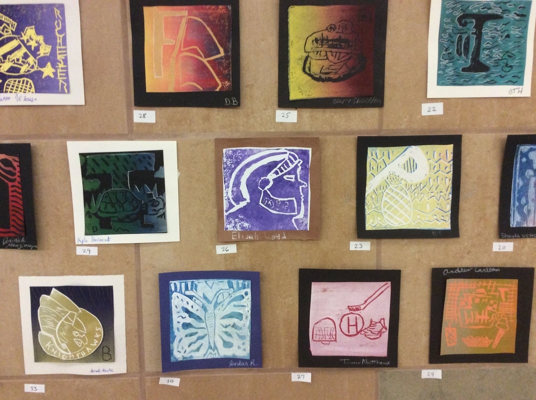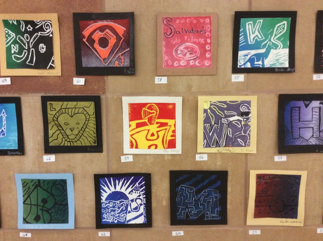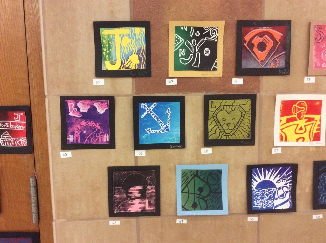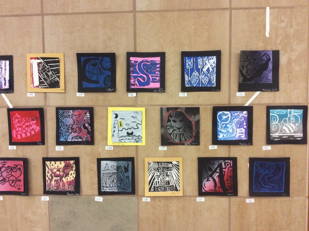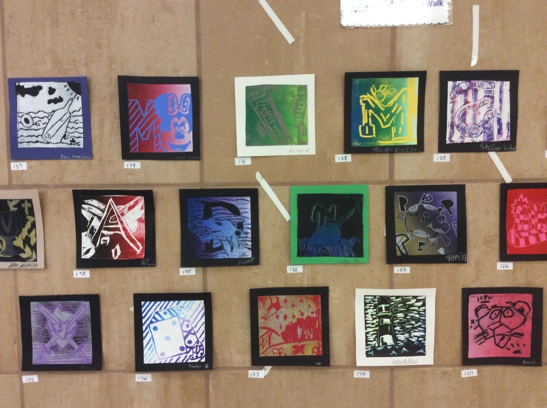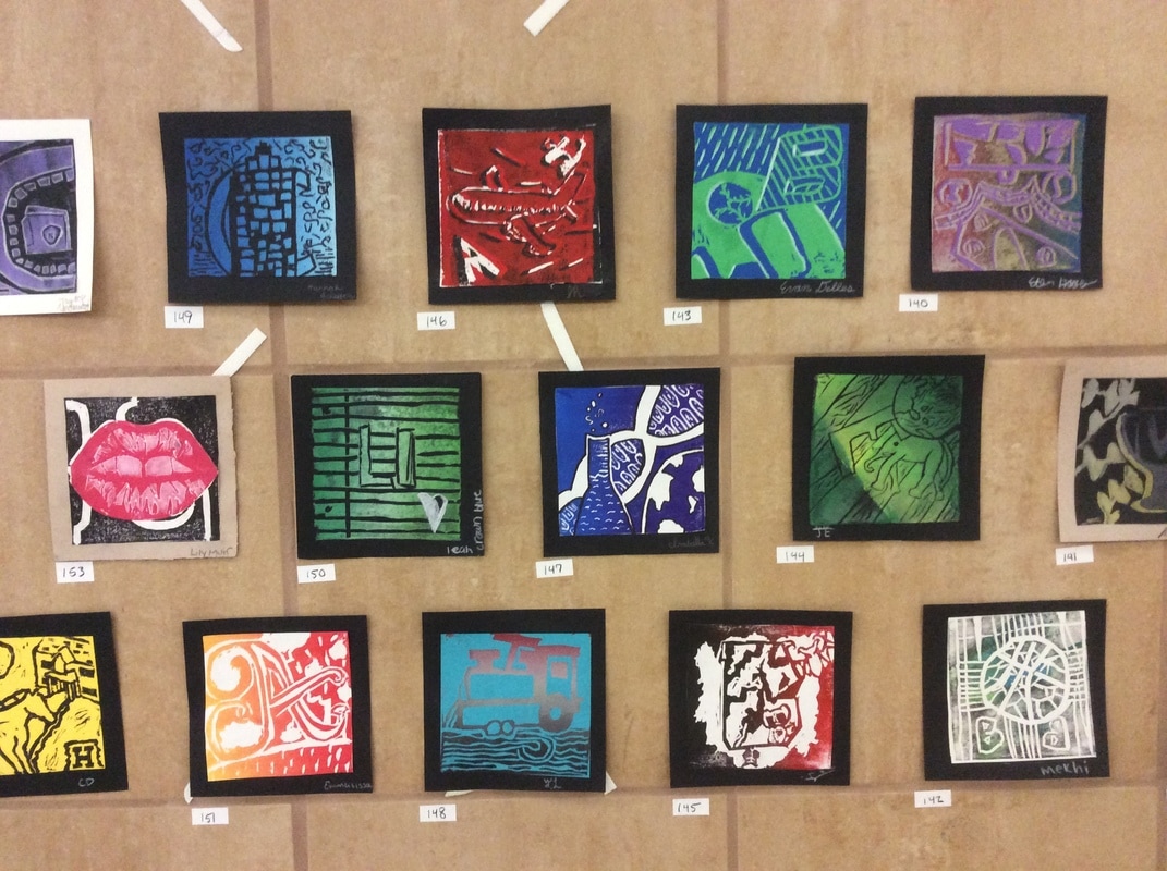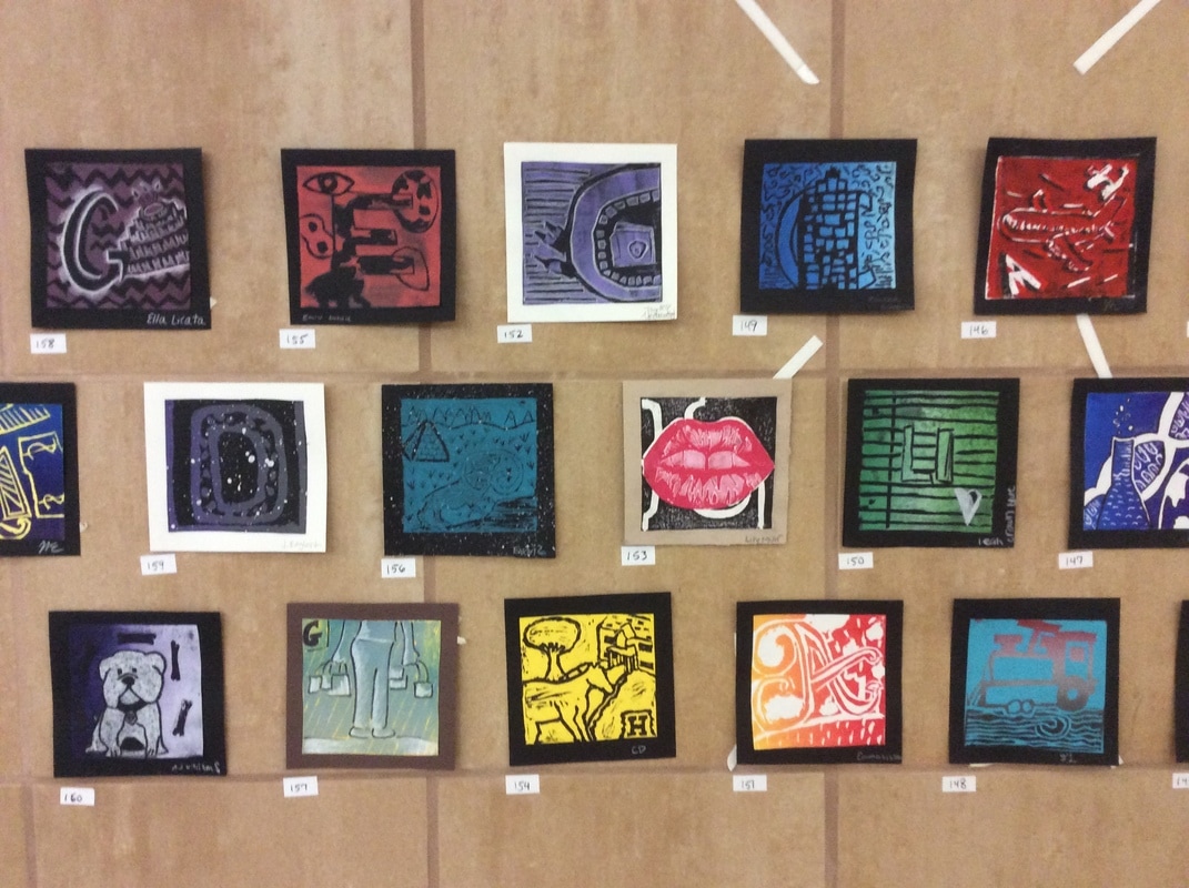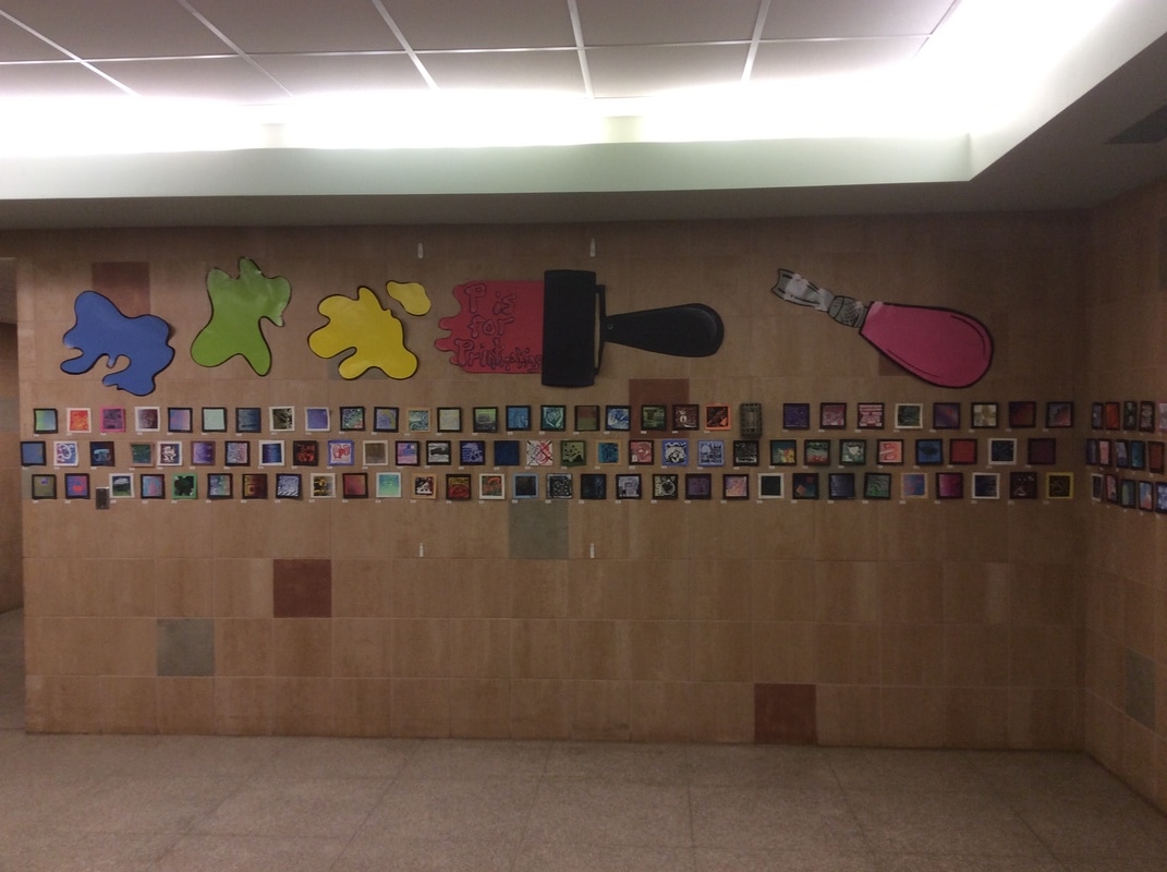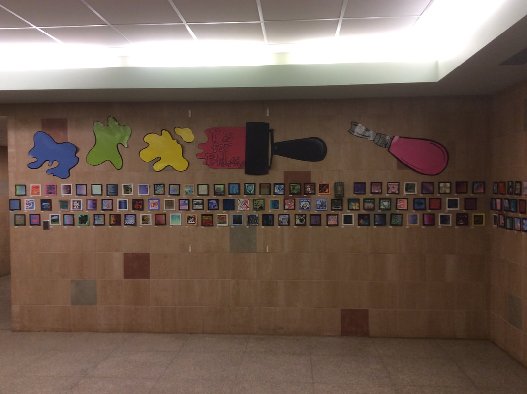


...and R is for Rochester
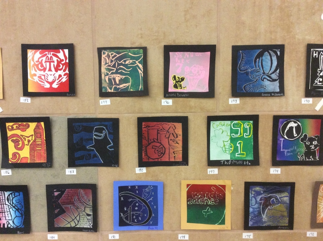
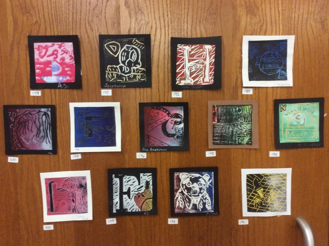
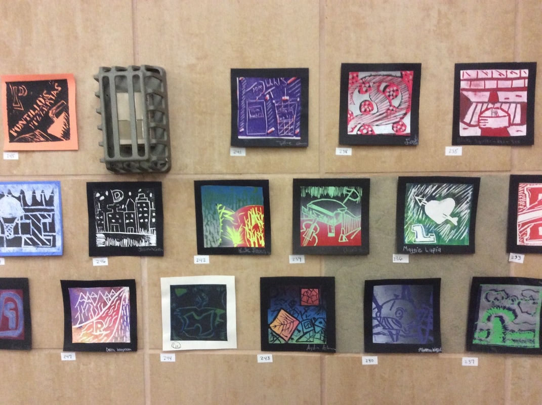
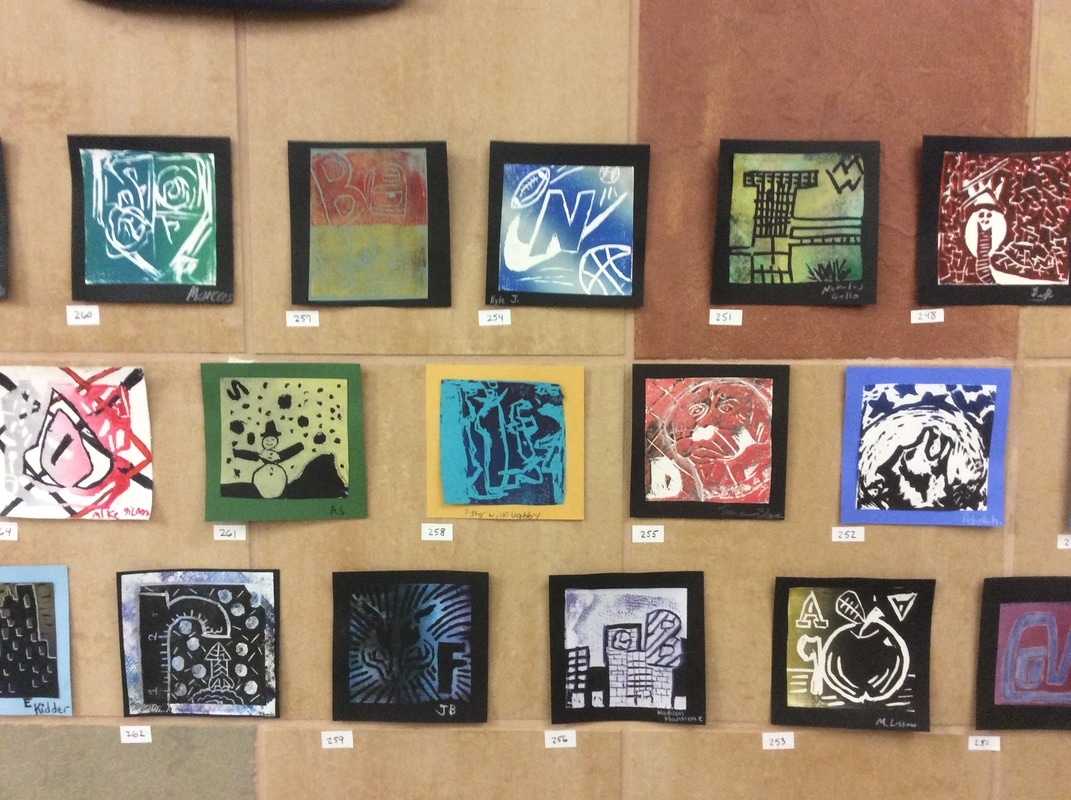
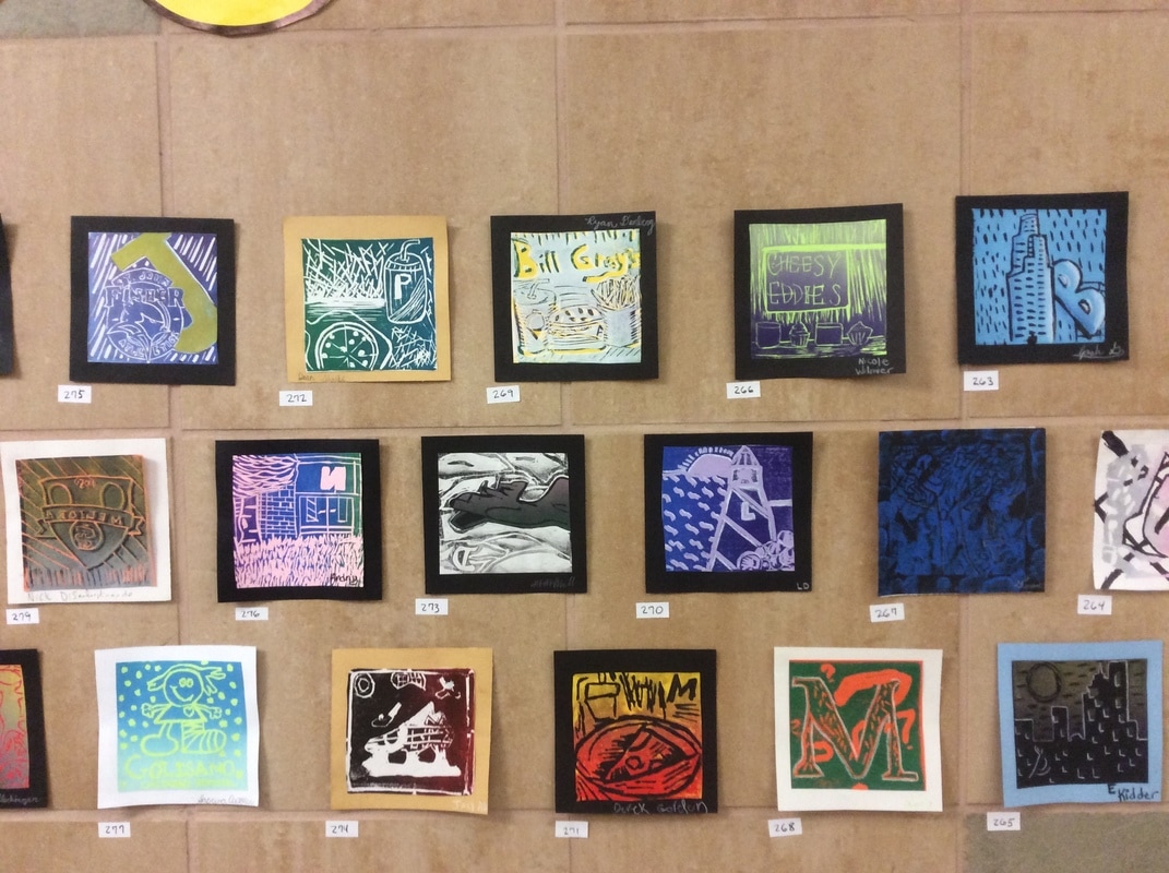
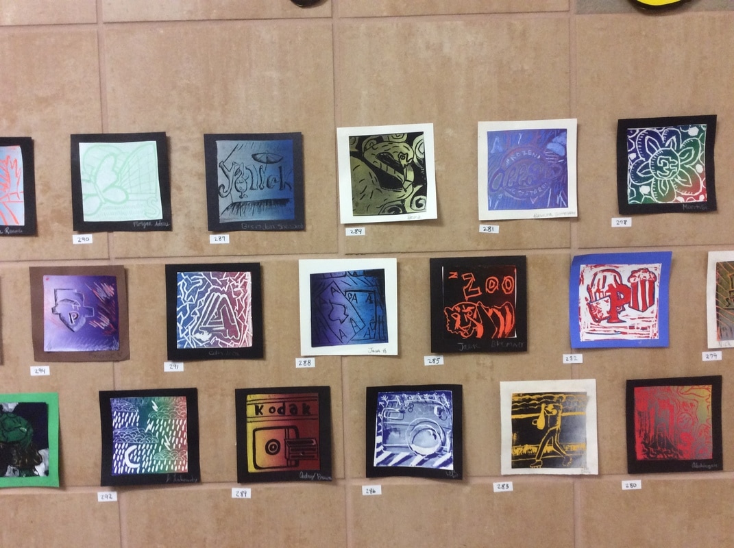
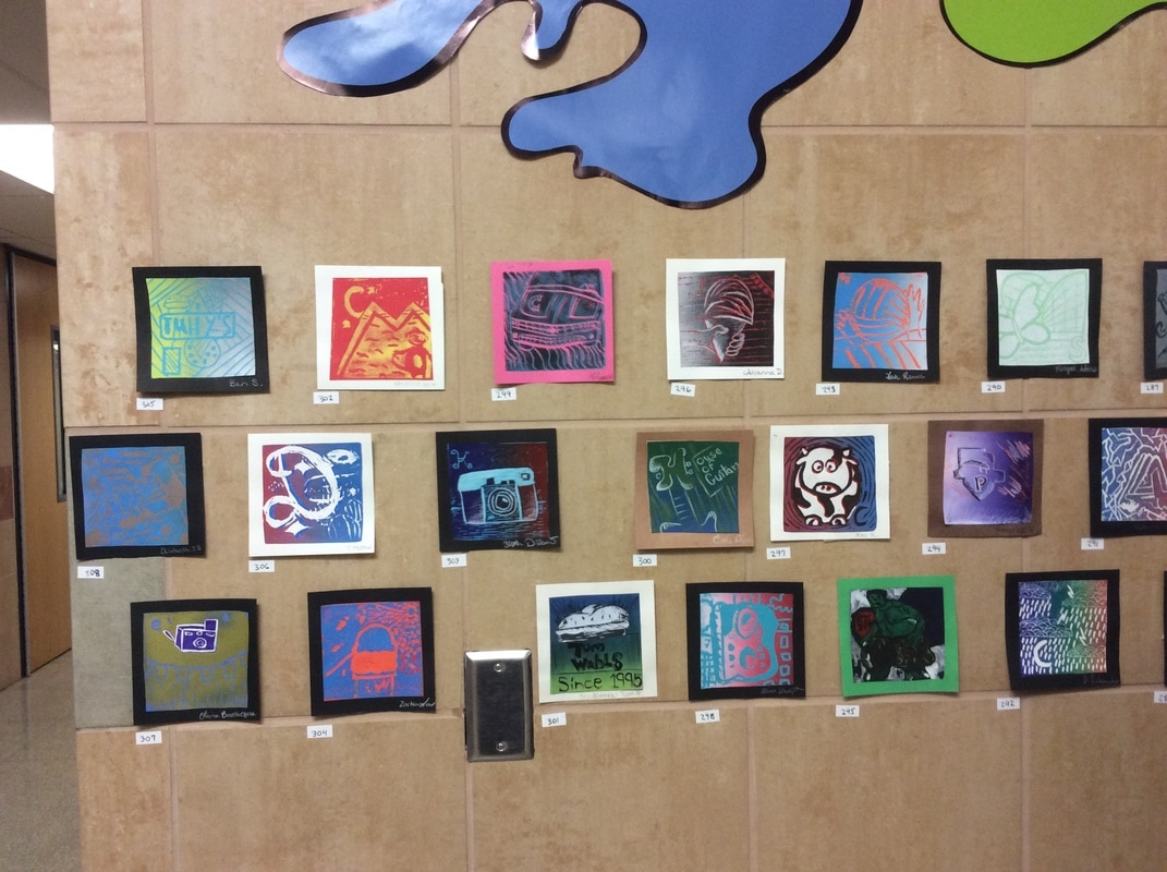
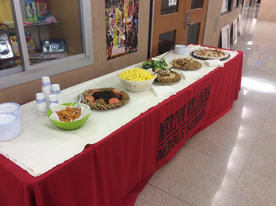
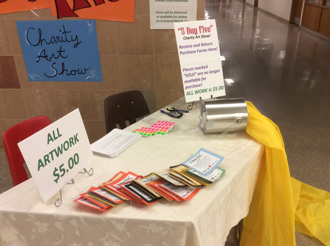
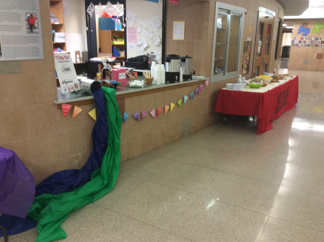
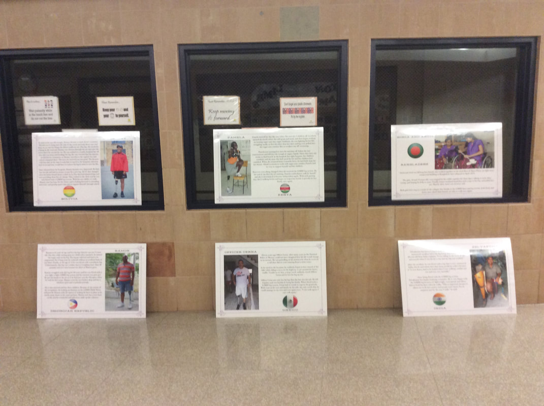
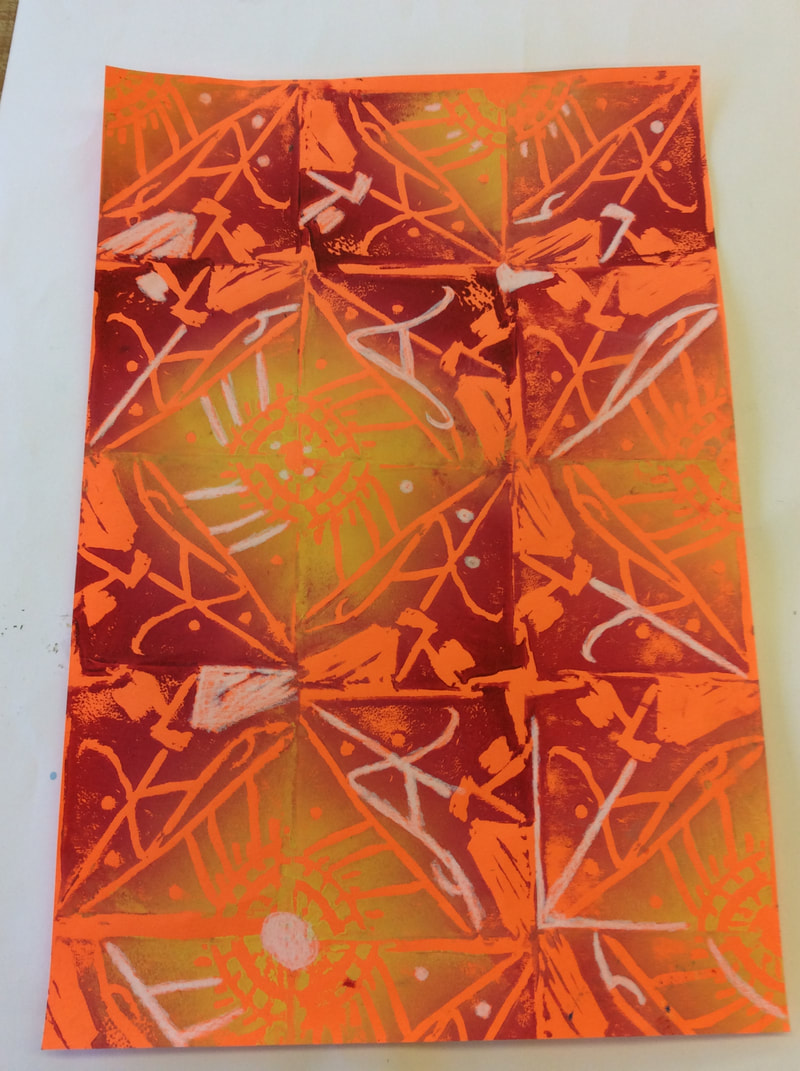
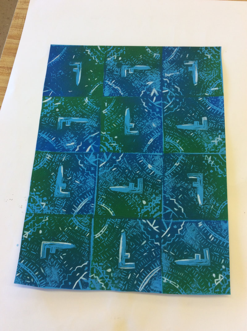
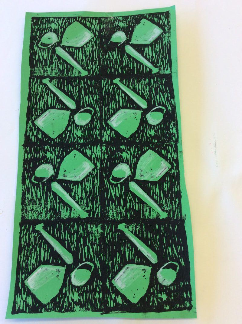
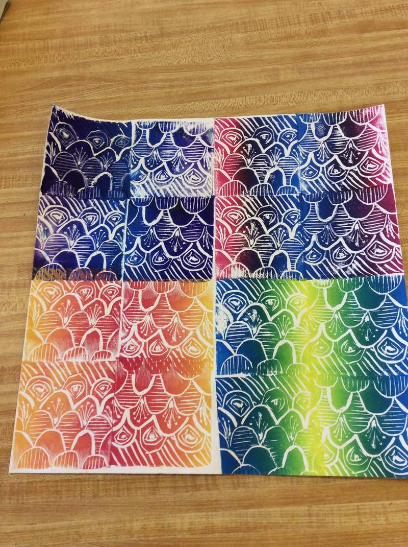
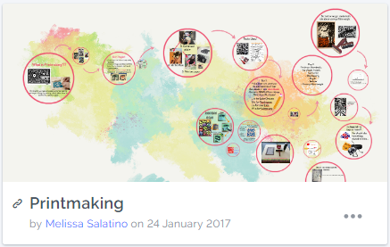
The project first began with an introduction to printmaking. The students looked at the work of Enid Marx, a textile printer and illustrator as a source of inspiration from there. The students were introduced to the assignment of creating multiple prints for the upcoming Five Buy 5 fundraiser for LIMBS International. The students each selected a letter and had to come up with a place or a part of Rochester, NY that went with that letter. This could range from locations, businesses, important figures, etc.
|
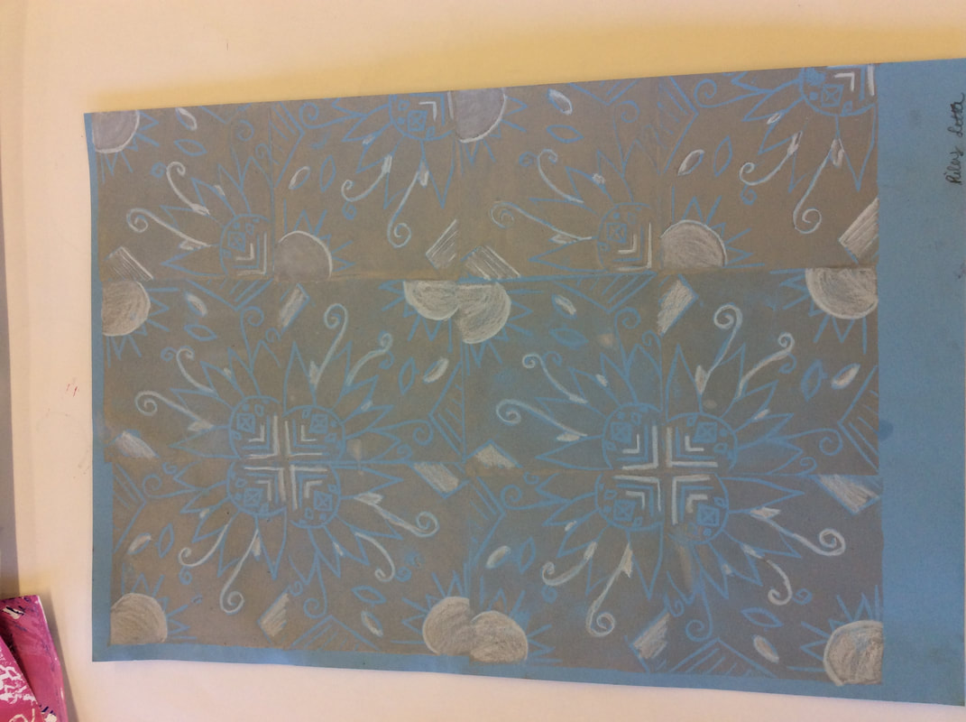
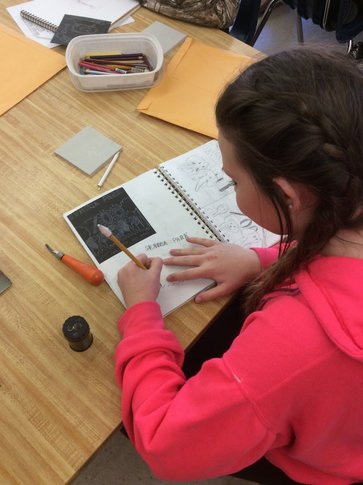
The students began to sketch out four different thumbnail designs for their possible design. The students were required to include the letter the chose, an image that represented that part of Rochester (if it was a business, it had to be more than just the logo), a variety of line weights and texture. The students then discussed the meaning of line weight and learned that it had to do with the thickness of the lines. The lines helped create emphasis, value and texture.
|
|
|
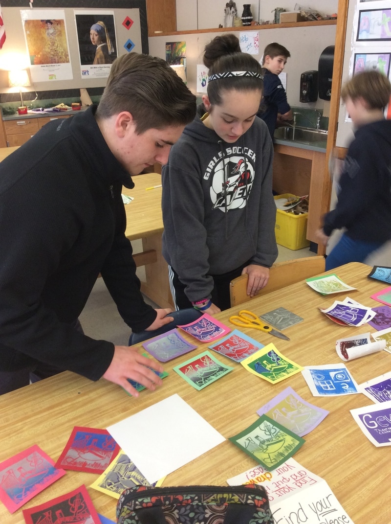
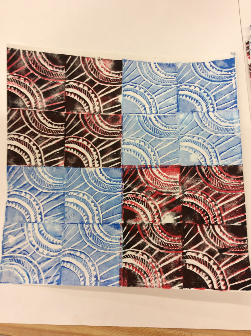
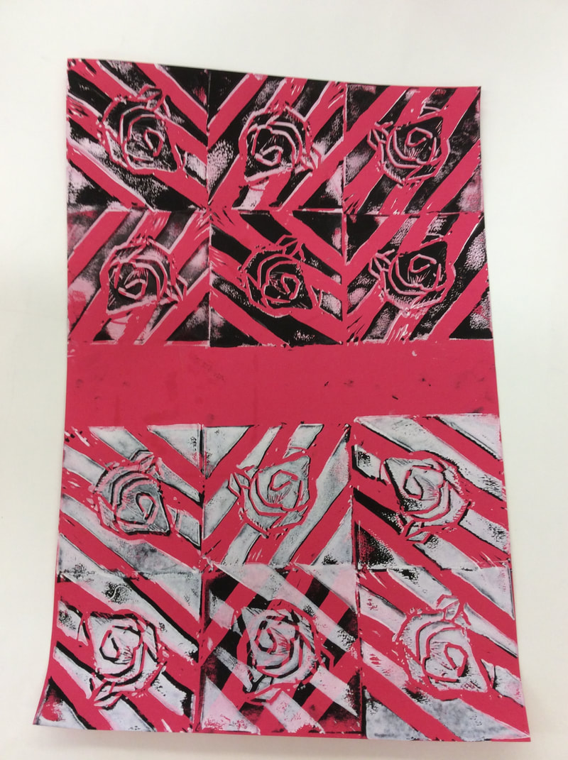
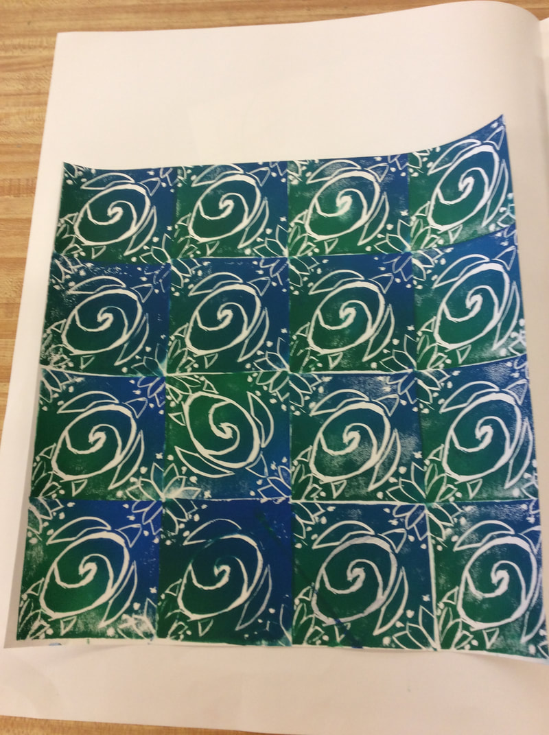
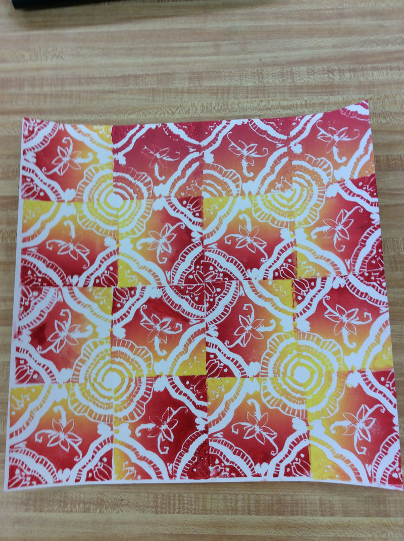
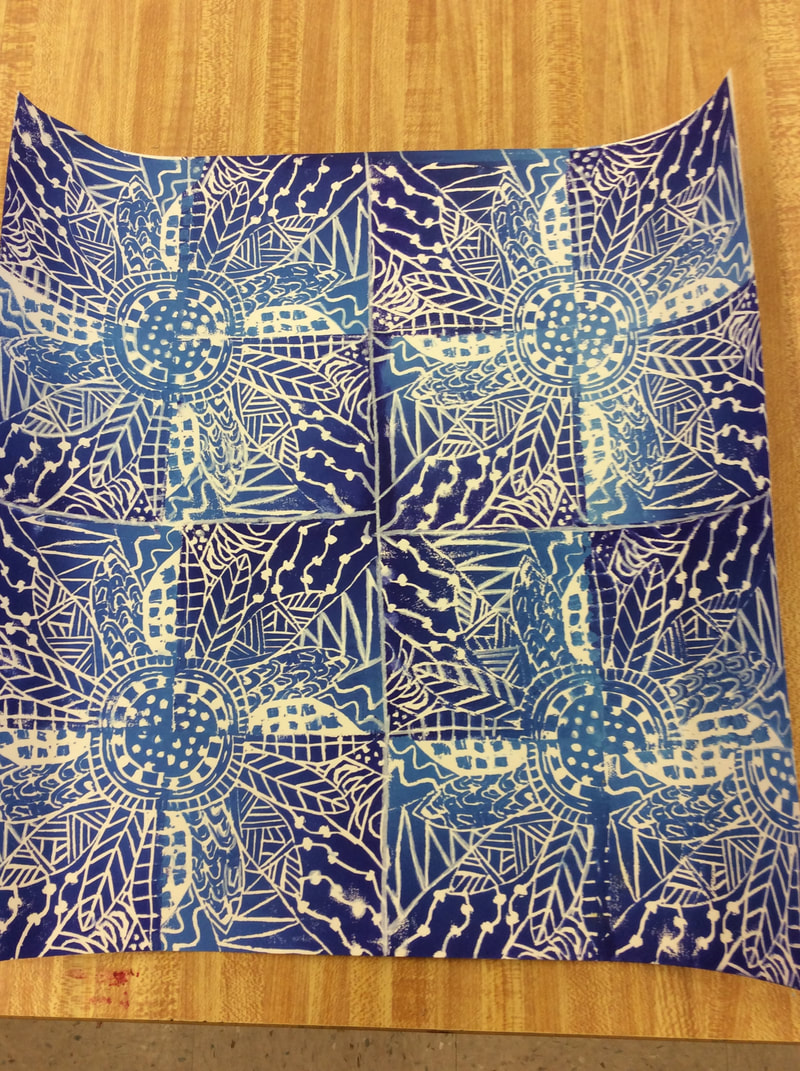
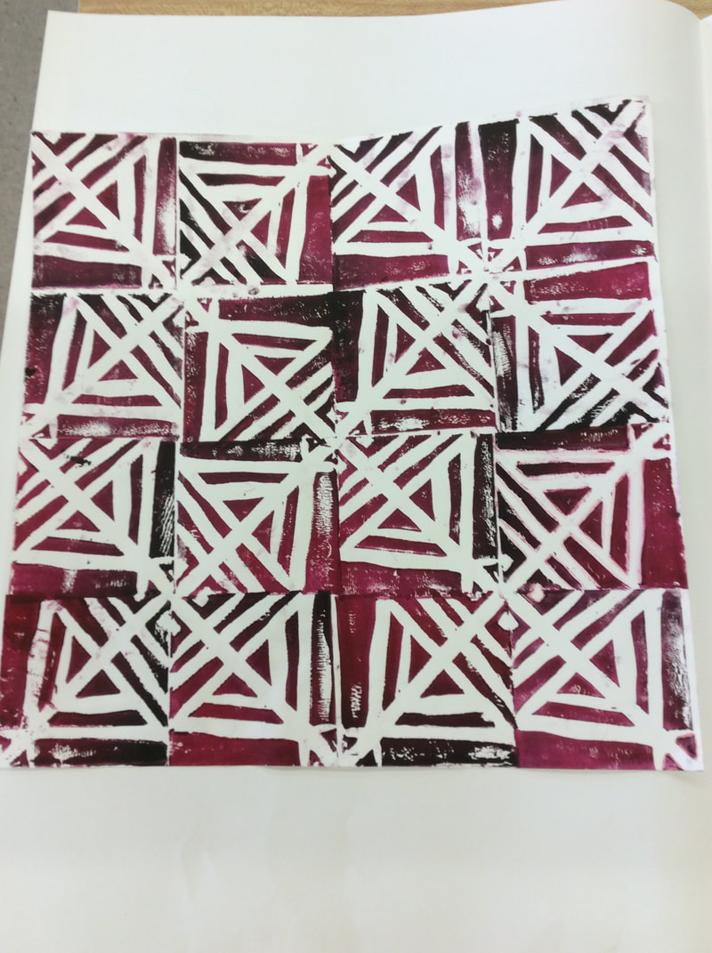
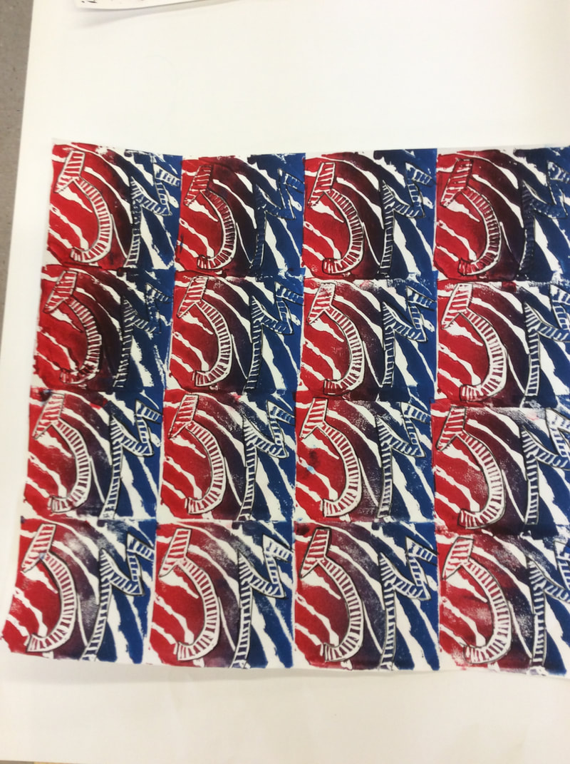
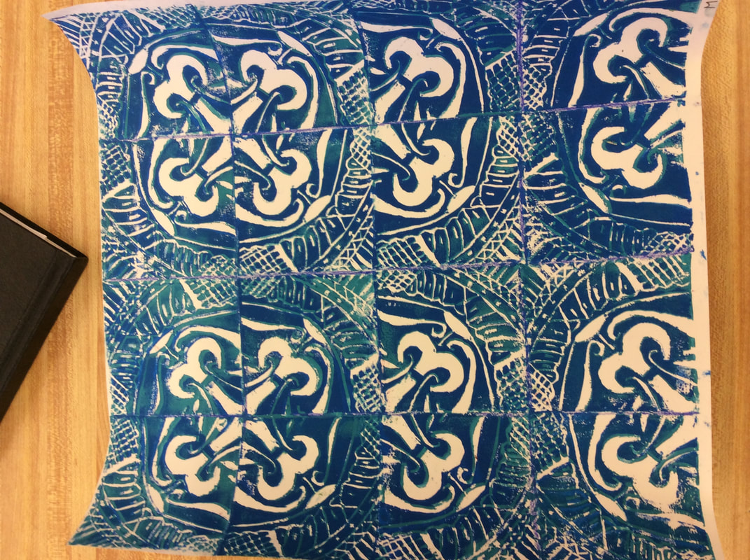
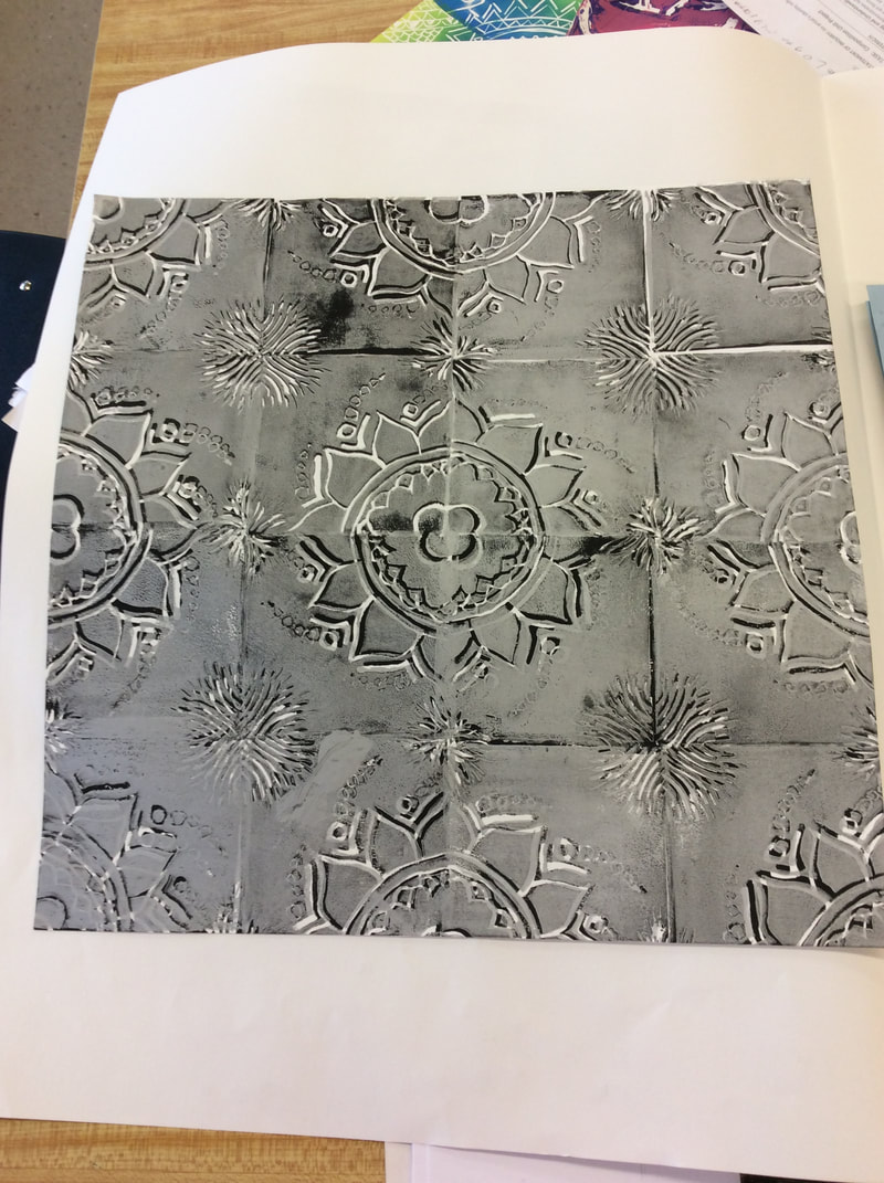
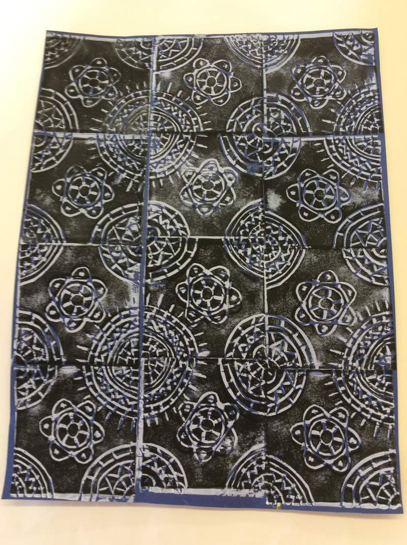
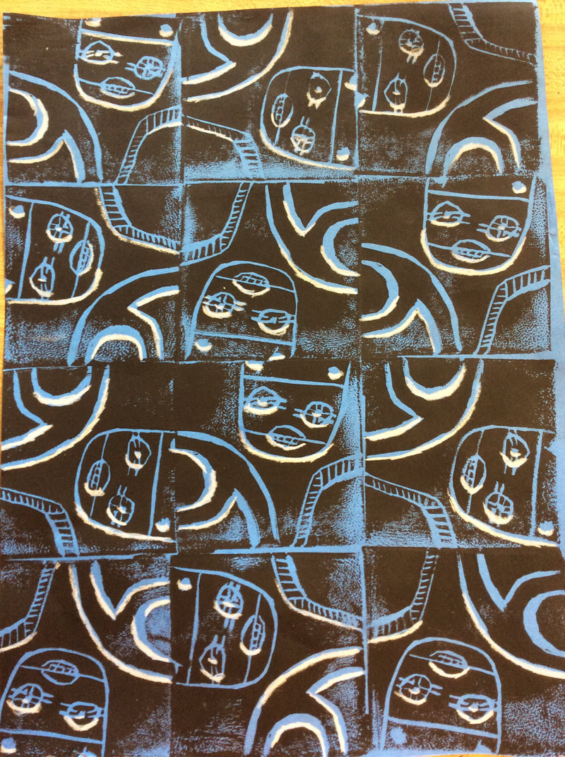
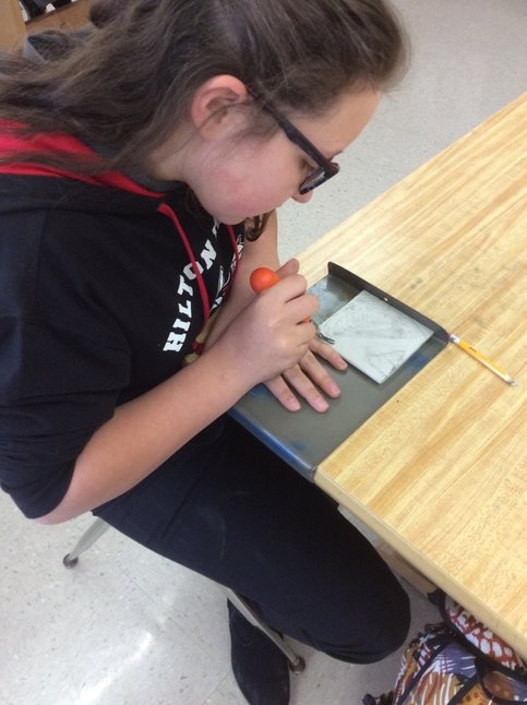
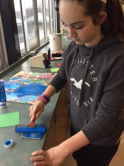
Once the student's designs were ready, they transferred their prints onto the rubber linoleum. The students then learned the safety measures and proper way to safely carve their designs without hurting themselves.
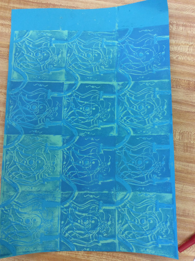
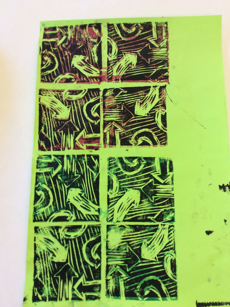
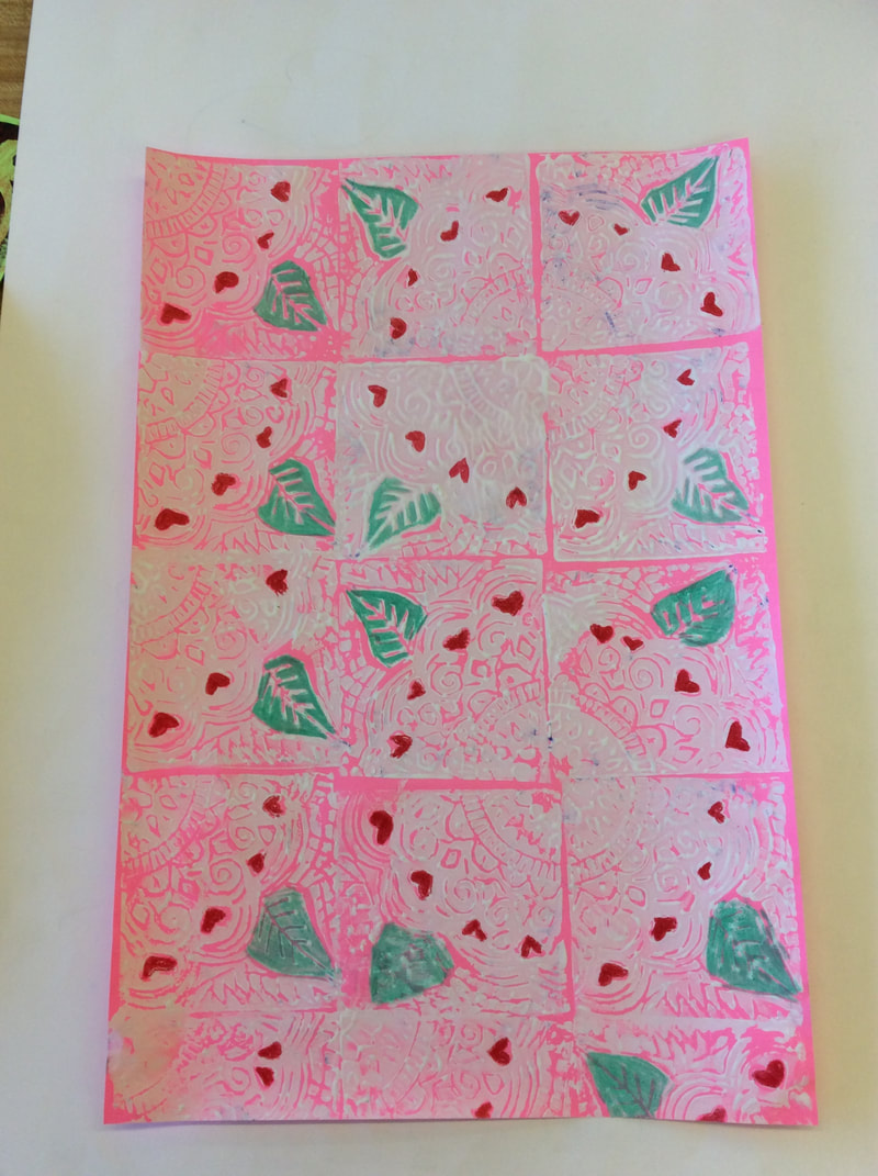
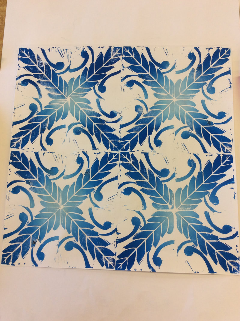
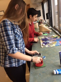
After the students were satisfied with the outcome of their plate, they began to attempt to print on the plates using a brayer, ink and a barren. The students quickly learned the fine balance of adding just the right amount of ink. The students also then made adjustments to their plates based on how they felt their image looked printed.
|
|